옵티크 텍스트 레귤러
Optique Text Regular (in-process)
한글과 라틴을 위한 다국어 글꼴 디자인 프로젝트
Multilingual typeface design project for Latin and Hangul in optical sizes
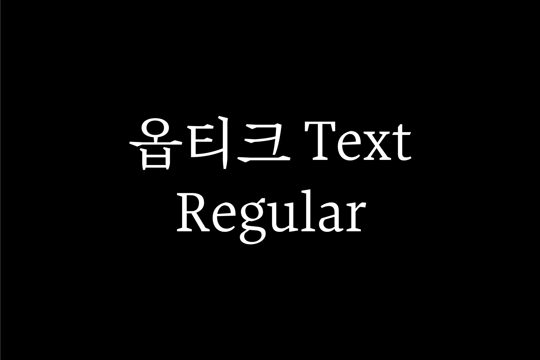
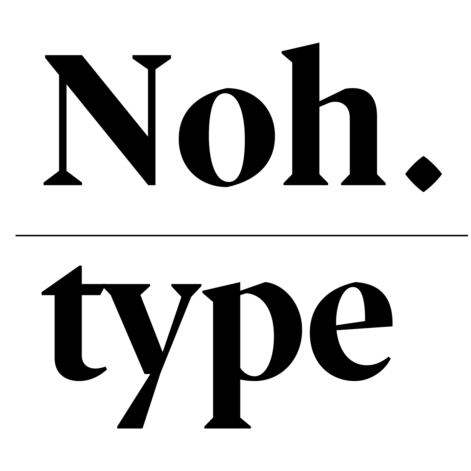
«옵티크»는 한글과 라틴 문자를 위한 다국어 글꼴 디자인 프로젝트이다. 각 문자 고유의 쓰기 도구, 즉 한글은 붓, 라틴 문자는 넓은 펜촉을 바탕으로 디자인하여 서로 다른 두 문자의 인상을 조화롭게 만들었다. 옵티크는 시각적 크기에 따라 글자가족을 본문용과 제목용으로 나누어 구성했다는 의미로 프랑스어 옵티크(Optique)에서 따 왔다.
«옵티크 텍스트»는 낮은 굵기 대비와 큰 속공간으로 작은 크기에서 잘 읽히는 본문용 글꼴로 디자인했고, «옵티크 디스플레이»는 높은 굵기 대비와 돋보이는 세리프로 독자의 눈길을 끌 수 있는 제목용 글꼴로 디자인했다.
2019년 디스플레이 Regular, Bold 버전을 출시했으며 2021년 텍스트 버전을 출시 예정이다.
* 이 글꼴은 노은유의 헤이그왕립예술학교 타입미디어 졸업 작품이다. (http://typemedia2017.com/eunyou)
* Typographica의 ‘Our Favorite Typefaces of 2019’로 선정되었다. (https://typographica.org/typeface-reviews/optique-display)
«Optique» is a serif typeface based on the tools of each script; broad nib for Latin and pointed brush for Hangul. «Optique» simplifies the shapes of Latin and Hangul while preserving the way of writing for each script. It is designed to achieve unity; to have the two scripts appear as one. It consists of three styles: text regular, display regular, and bold.
«Optique Text» has lower contrast and a larger x-height than the display version.
«Optique Display» is intended to stand out and create a mood that entices the reader into the text. It has high contrast with more pronounced serifs.
«Optique Display» regular and bold was released in 2019 with «Optique Text» scheduled to be released in 2021.
* This typeface was Eunyou Noh’s graduate project at the Royal Academy of Arts, The Hague (KABK).
* Chosen as ‘Our Favorite Typefaces of 2019’ by Typographica.